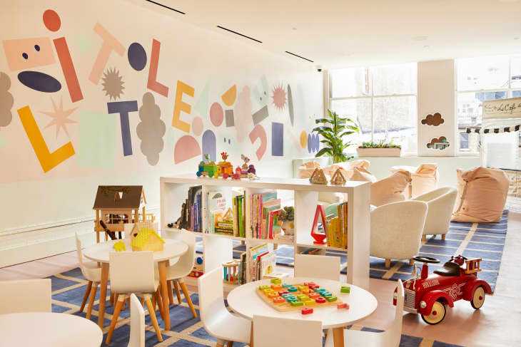
Remember when we all lost our minds over The Wing’s decor when founders Audrey Gelman and Lauren Kassan opened their first outpost in NYC’s Flatiron district back in 2016? With every subsequent club location, things have just gotten better and better. And it’s not just the broad strokes with furnishings and finishes—the details are on point, too. I mean, I even wrote a story about how pretty (and budget-friendly!) the blush dinnerware they use in their cafes is. So when we heard the SoHo location was expanding this week and opening a brand new concept, “The Little Wing,” a kid-centric space offering babysitting services and child enrichment classes, we had to take a tour. Turns out, the littles space is just as modern, minimalist, and full of smart decorating ideas as the main floor. Plus, it’s decked out in Crate and Kids products. So you really can get the look at home, whether you have kids or not, and here’s how.
1. Big Storage Pieces Can Split Up a Large Room

If you’re lucky enough to have a big space, you can still carve it up into separate play areas for your kids or yourself. All you need is a few tiered storage units like the 2-in-1 8-Cube Bookcase, which can be assembled vertically or horizontally to serve as visual room dividers. Graphic rugs anchor and define each little area and provide softness under foot. What’s great about the Crate and Kids pieces is they have built-in compartments and shelves at kid-height, so children can clean up after themselves.
2. Common Colors and Motifs Will Link Separate Spaces
The Wing has its own palette—six Benjamin Moore shades that are used throughout every single location in different ways. Dying to know? I was too, and I basically demanded the exact shades twenty times while touring. Here you go, and you’re welcome:
The Wing’s signature pink is a blend of Bride To Be (1009) at 75 percent and mixed with Chantilly Lace (OC- 65) at 25 percent
The ceilings are Bride To Be (1009) at 50 percent and mixed with Chantilly Lace (OC- 65) at 50 percent
Accent colors are: Daiquiri Ice (2034 -70) , Spiced Apple Cider (1201) , Midnight Navy (2067) and Yellow Marigold (2155-30)
When it came to decorating The Little Wing, the in-house interiors team didn’t scrap the above shades for primary colors or anything overtly “kiddie.” Instead, they found a way to work with them, making them collectively feel a little more youthful with fun decorative paint treatments, from a geometric mural to two-toned walls. The designers also painted cute scalloped trim around the built-in shelving units that hold The Little Wing merch, which you could totally do in a living room or bedroom as well.
3. Flexible Seating is Clutch
If you think beanbag chairs are cheesy, you haven’t seen Crate and Kids’ Adjustable Bean Bag Chairs . These guys can be laid flat like a cushion or raised up with the two straps to become a lounger. They’re also relatively stackable, so not a bad idea to keep a couple around if you’re in a small space and like to entertain around, say, your coffee table. Or throw a bunch in a circle, and create your own conversation pit.
4. Pegboard is a Great Material for Displays
Whether decorating a space for kids or adults, pegboard is a relatively cheap, inexpensive way to work your walls and turn them into vertical storage “units” for different kinds of supplies, books or even clothing and accessories. You can use colorful pegs or hooks to to hang your items from, or add little shelves that fit right into the peg holes. Just go to a hardware store. You can find this kind of thing there and paint or stain it to match your color scheme.
5. Remember to Look Up—and Decorate the Fifth Wall
On first glance, much of The Little Wing ceiling might look like it’s just white. But it’s actually a version of punched tin, inspired by the original ceilings in the SoHo outpost, painted in a whisper light pale pink (exact shade details above). Working with a fabricator out of Industry City, The Wing’s interiors team sought to match the authentic tin tiles in places where they could salvage them. And as for the entrance, they had this fun punched patterned tile of their own created, which features their special logo among other decorative motifs. Tin is back in, so consider this kind of finish for your ceiling, backsplash or even walls. A matte paint job makes it feel new again, and it’ll always add character to a cookie cutter space.
So are you super inspired by this chic kid space? I know I am, but the jury is still out on whether I should paint my bedroom walls The Wing pink.

Leave a Reply