As the creative director—and cofounder, with brother Marc Freeman—of Camilla and Marc, Australia’s beloved homegrown women's-wear label, Camilla Freeman-Topper knows how to build an ensemble. She imagines a collection and brings life to a vision. She knows these things take time—rushing is not the way to stoke the fires of creativity. But she also knows about striking while the iron’s hot—as in, say, snapping up the in-need-of-work house around the corner sitting on the market after stopping by on a whim.
Which is why when Freeman-Topper saw what’s now her family’s home in Sydney’s tony eastern suburb of Bellevue Hill three years ago and fell in love with it, she called her husband, Dave Topper, to come home from business in Hong Kong. “There was something about it—the late morning light that was sort of seeping through the arches. It was reminiscent of Chateau Marmont, and had moments that felt really special,” she recalls of the way the 1930s six-bedroom house romanced them. “I think people had put it into the too-hard basket, but a project like that for me is extraordinarily exciting.”
That doesn’t mean the designer jumped immediately into ripping out the dated green carpet or timber paneling that had gone orange over time. With her penchant for patience, Freeman-Topper understood she would only fully comprehend the house’s needs—and her family’s—from the inside. So the couple and their three children moved in for one year, along with the richly textured, vibrant furniture of their previous home, to “wild” effect. “The ideas and concepts we had when we bought it, before we moved in, changed completely once we lived in it for a while,” she says. “The rhythm of the house and its energy were really important to understand.”

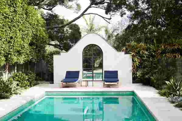
To make space for a pool that receives ideal all-day sunlight, they moved the garage underneath the house, which involved extensive excavation.
After their year in quasi-quarantine, the family of five moved out, making room for an extensive yet sensitive two-year renovation conceived by architect Luigi Rosselli of LRA that included tearing out the sculptural "central spine,” aka the three-floor staircase, and reimagining it with a brass handrail meticulously crafted on site, natural alpaca carpet, and alabaster ceramic pendants.
Meanwhile, Freeman-Topper honed her understanding of color, fabric, and texture as they pertain to interiors as opposed to fashion, in part through a fruitful research trip to Milan during Salon de Mobile with her interior designer, Romaine Alwill of Alwill Interiors. “That’s where it all came together,” she says. The pair’s mood boards—highlighting the work of Joseph Dirand and Vincent van Duysen, along with 1930s and ’40s Scandinavian homes—evolved significantly as they pored over hundreds of photos they’d taken to carefully curate each room.
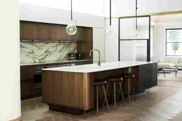
“I have very clear ideas of what it is I like and don’t like,” says Freeman-Topper, who designs her label’s stand-alone boutiques in Australia. “It can sometimes be a bit fraught when there are two creatives working together, but the experience was so beautiful and symbiotic.” Together Alwill and Freeman-Topper zeroed in on minimal Northern European styling and textured, tonal touches that would unexpectedly play with the home’s grand traditional features, namely its arches and decorative ceiling detailing. To match the smoky oak flooring, they laid in a painstakingly planned herringbone pattern for beautiful flow; a perfectionist painter took to the original orangey timber with his brush, creating natural-looking veins so it would match the new wood (see the formal dining room’s coffered ceiling).

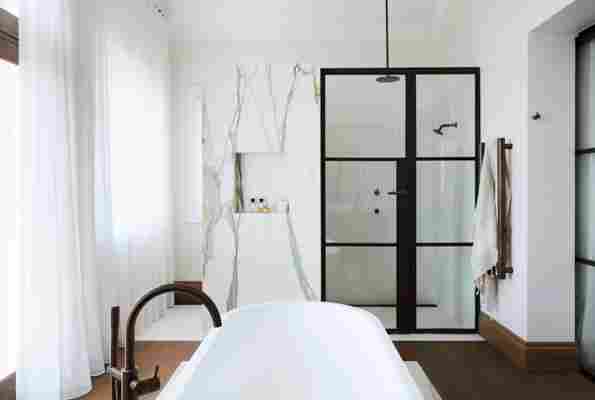
The master bathroom is all about timber and marble, designed as a generous yet understated place to enjoy impeccable views of the Sydney Harbour Bridge. It was originally a sunroom, which the designer made her office. “But I would find my husband standing in there staring out, and I thought, It has to be used in a better way.” He had the lightbulb idea: “He’s like, ‘I want to stand and have a shower and be able to look straight out and see the harbor.’ It’s very untraditional and loads of people might be put off, but there’s more than enough privacy and I thoroughly enjoy waking up and getting ready and seeing what’s going on on the water—it’s a really calm, sensory experience.”
Ultimately they brought in entirely new furnishings and decor, including some seen in Milan, the one heirloom exception being an “extraordinary” Art Deco bar trolley Freeman-Topper’s late grandfather left her that she recalls from childhood and that she uses every time she entertains, which is frequently. Other furniture was designed by the threesome and made to fit exacting standards, including the master bed in olive leather with leather fluting and brass detailing, and the glass and steel informal dining table that transitions from seating 12 to 20—“an exercise in both design and engineering.”
There was plenty of conversation around curves—in every room there are curved and straight elements—and Freeman-Topper admittedly became fixated during the years-long project. “Because we came from such a bright, richly colored home, I really wanted this home to feel super calm and super tonal,” she says. “It was a non-negotiation for me. But sometimes that can be a little bit sterile, so it was really important we built those tones up in different layers to have that overarching sense of calm and warmth.”
Contrary to the atmosphere of many contemporary-leaning homes, this one manages to be supremely homey, relaxed, and welcoming. “It’s like a boomerang,” describes Freeman-Topper of their ever-revolving door that opens for poolside barbecues, pre-dinner cocktails in the Sydney Harbor–view loggia, and lustrous dinners in the grape-clad formal dining room. “Our friends just want to keep coming over.”


Leave a Reply