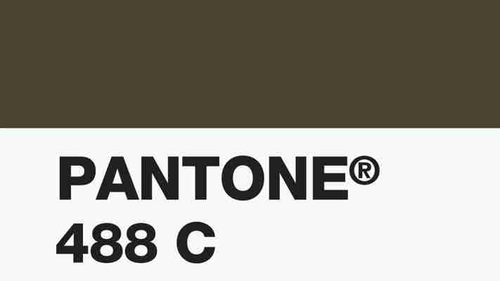
In 2012 the Australian government enlisted market research firm Gfk to determine the world’s ugliest color. Why? To use it on cigarette packaging, of course. After surveying 1,000 smokers, the most repulsive hue was crowned: the earthy green Pantone 448c , also known as opaque couché. “It was described as looking like death, filth, lung tar, or baby excrement,” wrote Donald G. MacNeil Jr. in the New York Times . But Fast Company spoke with graphic designers Milton Glaser and Debbie Millman about the color, and they didn’t necessarily agree . “It reminds me of the carpet that Isaac Mizrahi had in his apartment 20 years ago, and I remembered thinking that it was very elegant and kind of chic,” said Millman in a video interview. Glaser added: “No color can be preferred or not preferred in isolation. Every color is in context to another color.” The experts have spoken, but what do you think? One note: The Times reports that Australia has seen great success in getting smokers to quit. Visit fastcodesignom for more.


Leave a Reply