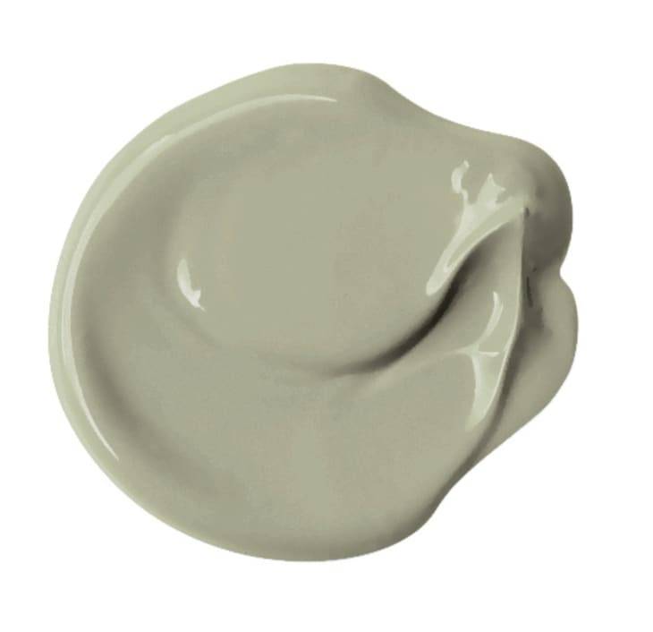
I don’t know about you, but it feels like 2021 is breezing by. Case in point: Paint companies are already talking colors of the year for 2022! PPG’s first up, and today, they’ve officially declared 2022 the year of Olive Sprig (PPG1125-4) , a sprightly gray-green that channels the great outdoors and the resiliency of nature to signal regrowth in what’s hopefully a post-pandemic world, sooner than later.
With many people spending more time on screens than ever, PPG wanted a shade that would speak to the desire to take it outside. “As many of us know following a year of lockdown, the easiest way to shift your mindset is to change your environment,” says Amy Donato, senior color marketing manager of PPG Paints in a press release. “While we begin to trade sweatpants for strappy shoes, recipes for reservations, and a night in for a night out, our paint color preferences are shifting, too, in both residential and commercial spaces. DIYers, property managers, designers, and architects are shifting away from the stark, neutral palettes of yesterday and opting for color in all forms. Call it rebellion, but we are certainly here for the resurgence of optimistic colors to guide us into a new era of home design.”

According to PPG, this soft, soothing hue also offers a sense of rejuvenation. Though the name Olive Sprig clearly references olive trees, this silvery-green is also close in color to the aloe vera plant. Either way, the connotation is clear, when you think about the role olives played in ancient Greece and still play in the Mediterranean today. Olive oil is the lifeblood of that region and the trees themselves symbols of immortality and resilience. This shade selection also subtly plays into the classical design resurgence that’s been happening as of late, too, with things like arches, columns, and busts trending in the home design world.
PPG really hit the mark with a trendy, but still extremely usable, color. Sure, Olive Sprig is decidedly upbeat and not totally neutral, but it certainly can hang with natural materials like rattan, cane, and wood. The hue also pops nicely against warm brass finishes but works with cooler nickels, chromes, and matte black, too. I could see this color being used to pep up a home office and to ground a living room full of more luxe finishes. It’d also be a nice option for someone who doesn’t want to go with blue or gray for a serene-feeling bedroom. Can you imagine it surrounded by a bunch of plants in a sunroom or a bathroom? Me too. I’m digging the way it looks with the neutral checkerboard floors below as well.
This COTY selection feels special to me specifically, as I was one of a few home editors that actually got to sit in on PPG’s talks to arrive at this versatile shade during their annual Global Color Forecasting Workshop , which was fully digital this year and held at the beginning of 2021.
If you think a lot goes into the selection of these trending shades, you have no idea. I loved how nuanced these digital discussions got — with individuals from all over the globe weighing in on what certain hues mean in their countries and their particular facet of the color business, be it cars, planes, or even coatings for electronics. Somehow, from 30+ different opinions comes one COTY — and, typically, a larger palette that’s reflective of broader color trends that the COTY fits into seamlessly. This year’s palette is themed “Horizon,” referencing hope for the world — and the home — as the sun begins to set on 2021. Colors are organized into three stories under that umbrella: “Invaluable,” which is all about depth and warmth, “Introspective,” a palette that speaks to self-care, and “Inspired,” a set of bold, mood-boosting shades.
To learn more about Olive Sprig and the rest of the 2022 trend colors, visit PPG Paints or your local The Home Depot store or Menards in the Midwest.

Leave a Reply