When interior designer Nina Farmer was tapped to design a house for a family of four, the idea was to build from the ground up. A mother and father, along with their two teenage boys, envisioned purchasing a plot in Westport by the beach in Connecticut.
But when they came across a deteriorating home in the Connecticut hamlet, their plans changed. “It’s a storybook house, from the minute you come into the front entry circle,” Farmer says. Not long after that, the designer was tasked with reimagining this decrepit structure laden with history. Although preserving the house’s bones was paramount, its ailing state meant that much would have to be altered. In terms of design, the challenge was all about striking the right balance between old and new.
When it came to the exterior, Farmer opted to keep the beautifully aged patina shutters which line the windows—along with the sills on the inside. The interior, on the other hand, needed a significant amount of change: “The flow didn’t work,” Farmer recalls. That, plus the state of the structure meant it had to be completely gutted.
“I think sometimes it’s hard when you’re given a blank box,” she continues, “And in this house, even though we were gutting it, it was like, oh, there’s a real story here. I understood the direction where this could land.”
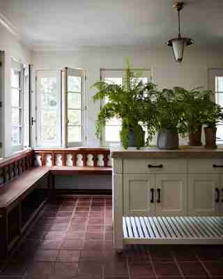
Clever ways were devised to preserve the home’s storied feel throughout its interiors. These included incorporating elegant white plastered walls—along with ceiling beams fashioned from reclaimed wood, and installing a terra-cotta floor that resembled the original. Vintage furniture and custom-made pieces were also brought in to help further propel the overall aesthetic.
In the dining room, for instance, an antique chair and light fixture cluster around a custom-made table that was based on a vintage piece (but resized so it could fit snugly in the space), while an arched doorway peers into the living room. The spotlight, however, goes to the boldly painted ceiling. After adding wood beams, Farmer hired a decorative artist to paint them in a classic, geometric design with a modern slant to it. “I wanted to let the architecture speak for itself,” she adds, “but with elements like these, you get some really interesting moments.”
Those moments begin right upon entry, when visitors are greeted by a fully stocked, richly tiled bar with a reclaimed wood counter. It was a point of debate for the designer and owners—who originally wanted to close off the space. In the end, they decided that it made sense to leave the space open and add a bold green zellige backsplash. It was unconventional and just felt right. “I don’t like homes that are too matchy-matchy, [where] you have the same color everywhere,” Farmer remarks. “But I do like where a repeated color comes in a different view or form.”
This is perhaps best exemplified in the limestone details seen throughout the home. Each instance is unique yet subtly works to help tie the space together. In the living room, for instance, Farmer used the material to design a custom mantelpiece (inspired by one she saw in the Netflix series Narcos Mexico, interestingly). In the powder room, the stone finds itself in the way of a delicately carved basin—“I wanted to go a step further, mixing in not only the vintage pieces, but some really ornate things like this,” the designer describes of the sculpted motif. With the juxtaposition of a more modern Moroccan checkerboard, the room—like the rest of the house—is an old soul with a youthful heartbeat. “We wanted it still to feel current, it’s a young family,” she avers.
Lastly, there’s the kitchen, where a rough and thick-cut slab of limestone adds a rustic touch to the countertop: it’s a sturdy, stain-impervious option that fits perfectly into the pastoral location. The room comes together thanks to a stone tiling made to replicate the exterior of the house. The result is cozy yet connected to the outside, which features a pool and surrounding garden that can be glimpsed through a set of doors and windows.
Upon close inspection, it’s also nearly impossible to tell that the stone was a new addition. As with the countless other details throughout the project, Farmer’s methodical approach lent itself to the timeless structure, bringing a home from the bygone era into the modern age with heart. “I really like this idea of seeing craft throughout the house and not having it feel like a new interior,” she shares. “I wanted it to have a layer, where you weren’t sure what was done or what was touched even though every surface is new.”

The façade still features original patinated window shutters.

A wraparound bench, terra-cotta floors, and a limestone counter set the mood in the mudroom.

Farmer custom-made the limestone mantelpiece in the living room based on one she saw in Narcos Mexico . The exposed reclaimed wood beams were added throughout the house to keep it from feeling too modern.
Farmer tapped a decorative artist to create the intricate ceiling design.
A custom-made island grounds the kitchen. Stone replicating the façade ties the exterior and interior together.
Visitors are greeted by the bar upon entry. Hues of green and blue set the earthy tone.
Farmer designed the custom-crafted limestone basin and sconces in the powder room. The checkered tiles add a modern touch.
In the primary bedroom, a painting by Claudio Bravo hangs above the Dmitriy bed, adding to the Mediterranean feel.
His and hers basins (one of which can be seen here) sit on opposite sides of the bathroom. In order to get rid of the repeating mirrors in the reflection, the designer opted for an antiqued mirror. A custom vanity and floor mosaic add more earthy hues.
To the right, the newly added extension ties in seamlessly with the rest of the home. To the left, charming Juliet balconies can be spotted outside the primary bedroom.
The basketball court was a newly built extension. It provides the perfect space for hosting.
A portrait of interior designer Nina Farmer in her favorite area of the house—the dining room.

Leave a Reply