If it feels like you’ve been seeing life through rose-colored glasses lately, it may be because life is great. But, it also may be because there are more shades of pink used in interiors than ever before.
In the past 100 years, the connotation and representation of the color pink has changed. A century ago, the hue was hard to come by and over time, with the advancement of technology and dyes, the rosy hue has become less feminine, more widely accepted by men, and more prevalent in our homes and in our lives.
From blush to magenta, pink now has its very own monochromatic spectrum.
“There is more pink paint used in interiors now than ever historically,” says Leatrice Eiseman, the color forecaster who serves as executive director of the Pantone® Color Institute and director of the Eiseman Center for Color Information & Training . “I don’t remember this much pink.”
It didn’t just burst onto the scene, though—let’s take a look back at pink through the decades.
A century of pink
In the 1920s, pink was associated with flirtation. “The connotation was naughty,” says Eiseman. Flappers would dab rouge on and above their knees to draw the male gaze to their thighs.
With sexy red as its mother color, different shades of pink can toe the line between romance and risqué. “There are different levels of connotation depending on the intensity,” says Eiseman.
During this time true pink wasn’t common in everyday life. Pinks tended more towards subdued tones like mauve, because technology at the time didn’t allow for brightness in clothing.
During World War II, women were working in factories and wore dull gray and denim, according to Eiseman. But after the war, women naturally embraced color again and pink came into the forefront. Red dyes, which weren’t available during the war, were available again—and so was the technology—and therefore pink-dyed fabrics were being produced.
“Mother is back in the home, wearing pink and it was then thought of as a feminine color,” says Eiseman. “There is this explosion of pink as a result of that.”
It wasn’t until after the war when Dior introduced its rosy hues that pink burst into the scene. “Those pinks, everyone was trying to copy,” says Eiseman. “After the late forties and into the fifties, that’s when the pink came forth, and the cosmetics industry had a lot to do with that too.”
Women could purchase affordable lipstick, rouge, and nail polish at the dime store, which gave them a rosy glow. During the post-war period, pink was associated with all things sweet and girly.

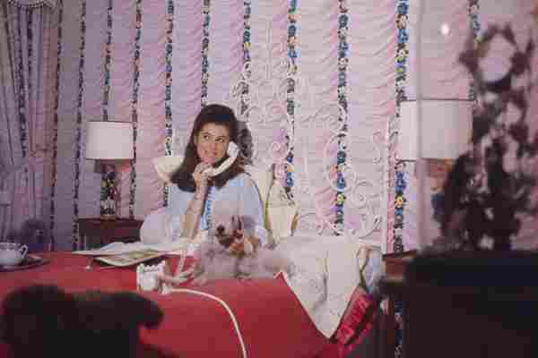
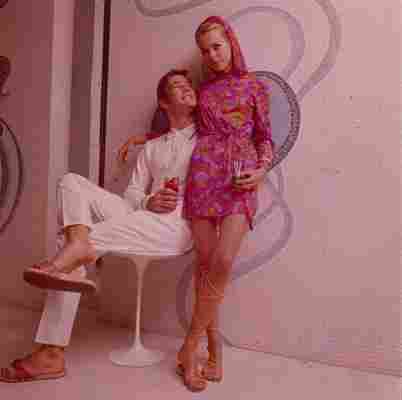
With sixties flower power, pinks were hot and super-saturated to jibe with a new groovy palette. “Technology was catching up and creating those brighter pinks,” says Eisman. “And English designers were coming forward with more pink.”
“Then there was an about-face in the seventies,” she continues, describing the overall spectrum used in fashion and interiors as earthy and muddy.
And then in the 1980s the hue was redefined. Pink was introduced into men’s apparel, and suddenly it was no longer effeminate. And in the home mauve and more subtle pink tones were paired with grays and teals.
“Even as far back as late eighties with ‘Miami Vice,’ tough cops were wearing pink and lavender,” says Eiseman. “It became acceptable. And as time has evolved, there has been less thought of pink for girls and blue for boys.”
From the nineties into the early aughts, the popularity of pink for men grew fashion-wise. And with pink now seen as a gender-neutral color, it is widely accepted and used in the world of interiors.
Today’s pink is more (gender) neutral
Pink didn’t just burst onto the scene, but has slowly been making itself known over the past few decades in a variety of shades. Examining recent history, we saw an explosion of pink with Pantone’s selection of Rose Quartz as one of their two 2016 Colors of the Year . And from there Millennial Pink proliferated throughout the lifestyle scene in 2017, and was seen in applications from iPhone covers to wall colors.
Other interior industry experts suggest that rosy metallics contributed to the growing color trend. “We attribute the recent popularity in pinks to the rose gold movement in metallic, which started a few years back,” says Sherwin-Williams’ color and trend expert Sue Wadden. “Quickly, this metallic shifted to a wall color movement. All of a sudden, everyone wanted pink on the walls and it really became a great backdrop color for home interiors.”
After Rose Quartz’s Color of the Year reign, pink hues became more and more prominent in interiors, and the paint industry in particular is leaning into the hue.
“EasyCare Paint continuously creates new pink shades because it’s a trend that is not going away,” says Elizabeth Mackey, marketing manager at EasyCare Paint & True Value. The paint brand currently has more than 70 shades with undertones ranging from yellow to gray.
Millennials started questioning the femininity of the color and embraced the hue. It was then reborn and rebranded as a gender-neutral color symbolizing health and well-being. Rather than a vibrant, intense bubble-gum shade, pinks today incorporate undertones like gray to soften them.
“Add a sepia tone to it. Make it more peachy,” says Eiseman. “There are lots of things you can do to a pink that make it look newer and fresher.”
“As pink continues to trend in the color world, hues that are not overly feminine have emerged, making it easy to infuse into your home,” says lifestyle blogger and EasyCarePaint’s brand ambassador Camille Styles .
Quiet blushes, dirty mauves, and soft rosy hues are all popular subtle interpretations of the shade.
“The most popular pinks are the paler, subdued hues,” says Sherwin-Williams’ Wadden. “They’re popular because they’re so versatile. They’re neither masculine nor feminine—and they pair well with all sorts of colors, from gray to green.”
Some soft pinks can even be considered “new neutrals” like Sherwin-Williams’ Rosy Outlook SW 6316 and Charming Pink SW 6309 , along with EasyCare Paint’s A172 Devine and A012 Cameo Pink .
While wall colors are trending towards more passive pinks, that doesn’t discount the use of a vibrant and adventurous hue. More aggressive and saturated pinks can be used to create a statement or highlight features in your home.
Add bubble-gum throw pillows to your couch. Ground your living room with a fuchsia area rug. Or add pizazz your table setting with punchy magenta.
“Try a darker pink for an accent wall, such as EasyCare Paint A017 Girl ,” advises lifestyle expert Styles. “Its undertones will highlight the more masculine features of your home, such as crown molding, exposed ceilings, or hardwood floors.”

Leave a Reply