This article originally appeared in the February 2007 issue of Architectural Digest.
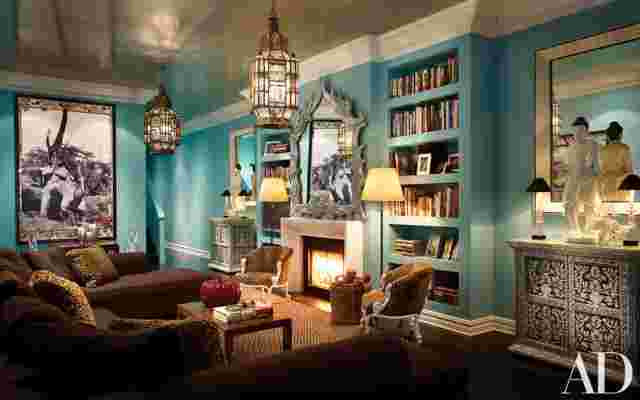
It sort of makes you blush a little bit," the client says, teasingly, of the 2,700-square-foot apartment she and her husband share in New York's Greenwich Village. But, truly, blushing is the least of it. The living and dining area alone, with its 14-foot-high ceilings, arresting palette and mural-size art, is more likely to stop a visitor in his tracks.
Which is just the effect they hoped for. "What's really cool about this apartment is that it's inspiring," she adds. "You don't get bored with it. It's cheery and exciting. The color and everything are invigorating." Having grown up in a similar environment—the vivid hues, the leopard-print fabrics—she couldn't imagine living any other way.
In fact, she'd known "since I was born," she jokes, that, like her father before her, she'd one day commission Thomas Britt, the venerable New York interior designer, to create her first home. "It wasn't even an issue. Tom isn't my uncle, but he seems like my uncle—he's just always been in my life. We have such great synergy," she remarks. Since her parents have lived in Britt-designed houses for the length of their married life together, she knew exactly what to expect. "Tom always decorates in really bright colors," she says. "We're not a family that's afraid of color."
In his long career, Britt has designed the interiors of some very grand homes; his client list is extensive and distinguished. He's certainly seen his share of unlimited budgets. And while this wasn't the case here, it didn't diminish his pleasure in the task. "She's a kid," the designer says of his client, fondly. "She's got it! That girl knows what she wants."


Britt, working with architectural designer Peter Napolitano, of his office, dramatically remade the residence: "We gutted the place," he remarks. While the floor plan remained essentially unchanged, much of the loft's detailing, including awkward-looking mantelpieces, plastic crown moldings and "rinky-dink cabinets and cupboards," in the designer's words, were replaced. And a 400-square-foot penthouse room was added.
The designer collaborated with another associate, Valentino Samsonadze, on the interior: "We literally cooked this up together," he says. Given the budget, the decision to use vivid colors was as much a strategic choice as it was an aesthetic one: "We sort of faked it a little bit with color," the client says.
For the living and dining area, she and her husband wanted a space they could truly live in. "We didn't want it to be a stage. We wanted it to be formal but comfortable, nothing too precious." They toyed with the thought of coral for the walls before settling on aqua, which was "so much moodier at night," she says—even more so after Britt paired it with the ceiling, which was papered and lacquered in silver. The leopard-print accents, which she couldn't imagine living without, take the form of sofa cushions and tub chairs. Even the sisal carpet, with its tiny geometric pattern in natural and brown, would make any visiting cheetah feel at home.

Leave a Reply