Renovating a house—especially one three centuries old—comes with the careful question of how new, exactly, to push. When Manhattanites Jessica and Mark Kleinknecht bought a 1725 Colonial upstate, they looked to AD100 architect Elizabeth Roberts for the answer. Since preservation is the hallmark of her Brooklyn firm, which has worked with clients such as Ulla Johnson and Maggie Gyllenhaal and Peter Sarsgaard , the couple requested her signature urban brownstone treatment with one key twist—its country setting.
“We wanted to open up the walls and let in light, and I thought, Isn’t that the challenge of a brownstone too? I bet she can do it with a farmhouse!” Jessica says. “Elizabeth has a really great way of preserving the history of a house, yet modernizing it.”
The property and barn, set on nine acres of wetlands, offered everything their apartment in Tribeca did not. It had nature with lush views, just over an hour away from NYC. It had fields and creeks in which their four kids could run wild, get muddy, and catch frogs. It had six wood-burning fireplaces to curl up next to. It had a covered porch for dinners outside. But it needed new mechanics, chimneys, and windows. Most of all, it desperately needed someone to piece together the puzzle of choppy rooms with unusably low ceilings, which evolved from an initial one-room cabin.
“Houses from that age have been added on to—a lot,” Roberts explains. “Some additions create delightful rooms while some are unfortunate, creating problems to fix. My job is trying to make the home rational again.”
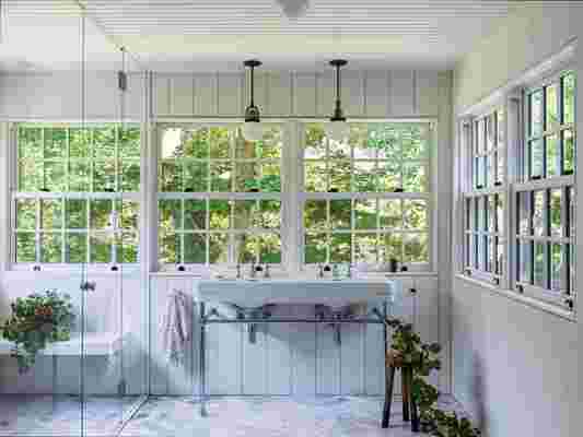
While working on the project, Roberts found the most unfortunate addition to be the upstairs bedrooms, which were built with ceilings so low one could barely fit a twin bed. “You just couldn’t sit up in it!” Jessica says. To remedy this situation, they raised the roofline to allow for proper bedrooms and a playroom with 10-foot pitched ceilings. On the bright side, the most delightful discovery was a vintage sunroom that had been used as a sleeping porch. Roberts saw a way to further improve upon the space, suggesting: “Let’s just put some water in there and make it a beautiful shower room!” With three sides of glass, the new primary bathroom quickly became her favorite space in the home.

Roberts refashioned a sunroom and sleeping porch into a stunning shower room. With glass on three sides, the primary bathroom boasts river views and loads of light. Its elevated position, as well as pedestal sinks and globe lights by Allied Maker , are notable highlights.
Then came their big 21st-century addition: Moving the kitchen from a dark, low-ceilinged room to a sun-drenched corner of the house was a feat that yielded glowing returns. They enlarged the space to allow for a wall of windows with beautiful views, meaning Roberts was able to echo that upper sunroom effect. It “reinforc[ed] what we love about the house,” she adds. The end result is a signature Elizabeth Roberts Architects showstopper of a kitchen but done in the context of the country. In lieu of an island, a wooden farmhouse table is the gathering spot. Simple iron lighting mingles with a cotton striped sink curtain while an oversized hearth is always burning. There are also no-nonsense, easy to clean, radiant tiled floors that are as practical as they are chic.
“The kids wear their Hunter boots and come in caked in mud. A lot of mud! And that’s what’s meant to be here,” Jessica says. “I didn’t want anything too precious or fancy. No super shiny fixtures or big slabs of marble. Nothing here feels slick or pretentious.”
Even though living in an all-new, all-white modern farmhouse was never a dream for the homeowners, Jessica admits she had a fear of dark, old rooms until Roberts changed her mind. With a light new kitchen in place, the architect spun its former spot into a low-slung family room complete with moody charcoal toned walls perfect for cocooning the family on movie nights. “It went from a dark kitchen to a super cozy jewel box of a room,” Jessica says.
They warded off white paint again in the dining room after the team cut into the sheet-rocked ceiling and exposed original, imperfect beams. The contractor quieted their knee-jerk reaction to lighten them up, warning that once painted, you can’t go back. Instead, he cleaned up the warm wooden elements, revealing original axe marks and notches in the process. “He was totally right!” Jessica says. “It brought out the history, and every time I see that room I’m reminded of the original farmhouse we’re living in.”

Roberts calls the South Salem 1725 farmhouse a “meandering Colonial” as it was added on to for three centuries. The façade retained the timeless black-and-white palette, and the classic covered porch is where the family takes nearly every single meal while the weather permits.

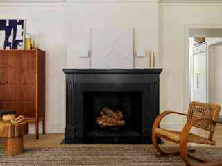
Interior designer Lauren Weiss dressed the living room in Scandinavian and European midcentury furniture, including a ’50s Swedish teak Yngve Ekstrom Bangkok cabinet, a ’70s Swedish Brutalist Pamono pine stool, and a ’40s French Audoux & Minet rope chair, all lending warmth against the dark fireplace. “The bones of this 18th-century farmhouse have the same quiet elegance as Scandinavian midcentury furniture, so I found myself sourcing really special pieces,” she says. For something current and edgy, Weiss added the Stahl and Band Amalgame lamp.
The original dining room’s axe-hacked beams had been completely sheet-rocked over. There was a moment of consideration to paint them white until the contractor, Gerhard Isop—who the homeowners call “a true carpenter”—intervened and cleaned them up. Now the natural warm wood gleams overhead. Juxtaposing its age and imperfections are modern furnishings, from Charlotte Perriand sconces to a Nickey Kehoe table paired with vintage Leggera Gio Ponti for Cassina chairs.
A new kitchen boasts a lot of glass and light, nodding to the primary bath upstairs. In creating another sunroom-style space, they let the lush greenery outside be the only color, keeping things minimal and rustic inside, down to the brick range enclosure and a country-style striped curtain under the sink. In lieu of a polished marble island, an old farmhouse table from Petersen Antiques is paired with Lostine Gordon stools and an overhead pendant from The Urban Electric Company .
What was formerly the kitchen is now the other heart of the home—the den. The family gathers here for movie nights (a flat screen is hidden behind the artwork by Agnes Barley) and roasts marshmallows in the fireplace. Roberts had everything painted Farrow & Ball Pigeon . “I love pulling aside one room and painting everything one color,” she says. While allowing this old space to retain its coziness and low ceilings, Weiss added a sculptural Stahl and Band coffee table, a 1940s Flemming Lassen high back chair, and a vintage striped Turkish Kilim area rug.
When the dining room’s patchwork of floorboards from various periods had to be replaced, the contractor saved them and repurposed them into tables (one is on the covered porch) and paneling for the powder room. The aged wood adds the warmth and original character that the homeowners craved.
A vintage Moroccan Breuckelen Berber runner connects the primary bedroom to the sink room where natural fibers and woods keep a minimalist feel. “With four children, the clients needed a calm and peaceful escape,” Weiss says. “This area was intentionally kept quiet and spare.”
Weiss designed a “respite” for the busy parents. She created a custom bed and bench layered in calming blues including a large pillow covered in Klaus Haapaniemi fabric and an area rug by Armadillo & Co.
Architectural alcoves create visual interest upstairs while adding extra resting places that are now delightfully usable. Previously, one could barely sit up in a twin bed. Now, a rattan daybed is easily accessed for afternoon reading or napping.
Roberts refashioned a sunroom and sleeping porch into a stunning shower room. With glass on three sides, the primary bathroom boasts river views and loads of light. Its elevated position, as well as pedestal sinks and globe lights by Allied Maker , are notable highlights.
The girls’ room is painted a whisper of pink ( Farrow and Ball Pink Ground ) with a sweetly patterned Rogers & Goffigon upholstered Roman shade. A dollhouse from PlanToys safely occupies the room’s non-functioning fireplace.
Upstairs the playroom got a big lift as the team raised the roof four feet to create a usable space for Legos, gymnastics, sleepovers, and even quarantine. Accented with wood beams and Noguchi lamps the shiplap walls and ceiling are painted in a creamy Benjamin Moore Cloud White . “It’s nice not to do a lot of sheetrock in these old homes,” Roberts says.

Leave a Reply