A client who literally refuses to take no for an answer may sound less than ideal, but for the team at Boston’s Hacin + Associates, one such energetic and creative collaborator’s approach led to aesthetic magic—and joy. “Truly, I would describe her—we all would—as a dream client,” lead interior designer Matthew Woodward says. “I’ve never had more fun on a project in my life.”
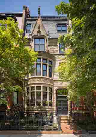
When Robin Nelson-Rice and her husband, Derica Rice, decided to move from suburban Indiana to Boston, their real estate broker and general contractor both felt H+A was the perfect match to reimagine a six-story 1881 Back Bay town house. However, founding principal and creative director David Hacin found himself quite busy at the time. “Robin looked at me right in the eye and said, ‘You don’t understand. You are going to be doing this project.’ And I actually loved that,” Hacin says. “As we were talking, we clicked, we connected, and that was it for her. She wanted to keep going with that process.” Soon, the client became intimately involved in every decision—with only a handful of exceptions. (“Let’s say you need a white paint; there’s 250,000 of them—I’m walking away,” Nelson-Rice recalls with a laugh.)
“A common theme throughout the project was asking for the impossible . . . and us figuring it out, at every stage,” says Christina Rankin Manke, who led architectural finishes. Nelson-Rice drove the unsentimental overhaul of the structure, including extensive reinforcement with steel, a distillation of complicated internal levels, and secondary staircases to super simple, spacious, and clean areas. It was a delicate balance of transformation and preservation that required solving many painstaking puzzles. “Searching for stone was like searching for artwork,” says Manke, who adds that Nelson-Rice was most interested in unique architectural elements she hadn’t seen before. “[S]he really [wanted] to push boundaries. For us, that was music to our ears.”
The home’s guiding light is arguably a graceful, ribbonlike staircase with a freshly ebonized handrail. “This really feels like a thread, unraveling and unwrapping from the ground all the way up to the sky,” Hacin says. “It’s almost pulling light in and pulling the dark accents up and out. It unifies the whole house.” The stair, which had been painted mint green and cream, is a point of orientation, revealing slivers of rooms and spaces along the way. “As you climb higher, the rooms become lighter, so more dark furnishings and fabrics are featured,” Woodward says. The opposite is true on lower floors. The stair itself is a gallery space through which dynamic art is woven, as well as a Merida carpet with intermittent custom hand whip-stitches. It helps imbue the space with a maker’s touch, which was an important for the designers. “You can see that the table’s been chiseled, something’s been carved or handwoven,” Woodward says, “and that really softened some of those glamorous, clean-line elements.”
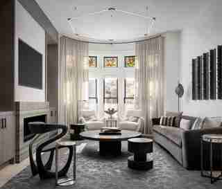
H+A worked to reinforce that concept with art and special finds, such as the curvilinear Object Studio chair in the living room, which was directly inspired by the fluidity and tonality of the staircase. Additionally, Woodward says, “we made decisions wholeheartedly based on viewing the space as a gallery for contemporary Black artists. Robin was really thrilled to do that. Early on, we were conscious of showing restraint in the materials palette, so we could really let the art stand out.” The dining room in particular was designed around a Russell Young portrait of Barack Obama, a piece Nelson-Rice says, “speaks volumes—it’s peaceful, it’s hopeful, it’s positive.”
Still, graphic stone plays off sumptuous velvets and leathers, and some rooms—such as the primary bedroom—were designed to be overtly moody. A chic library with sculptural chairs from the (now defunct) 1stDibs Gallery is a favorite space, and one where Nelson-Rice likes to read, reflect, and have Friday night Zooms with girlfriends. Woodward describes it as “sitting in a hug.” The entire home, Woodward says, embodies a sense of grounding and peace. Appropriately enough, it’s the couple’s first residence as empty nesters. “People don’t speak very loudly, it’s almost like a spa in a lot of ways,” he says.
In that, she succeeded, even after the stress test of four straight months inside—with their three adult children, who joined for COVID lockdown. But in some ways, moving in just before a pandemic proved a blessing in disguise. “We were sequestered, but we had the best time because you can have so many different experiences,” Nelson-Rice recalls. “[My kids] refer to it as home now, so there was the gift of that.” Musing more broadly, she adds of the design team, “It’s incredible what they were able to create here. I can just be here, but still be fulfilled and inspired by a different space every day.”

“If I remember correctly, Robin asked if she could move in in about eight months,” Woodward says. “Once we stopped laughing and crying, we got to work, and we delivered it in 14 months, which was pretty incredible.” There was a strong collaborative spirit from the start of the six-story 1881 town house project in Boston’s Back Bay neighborhood to the very end, one Hacin calls an “inspirational loop.” In Nelson-Rice’s words, “It’s a lot of experiences in one.”

Tiffany glass in the main salon was one of the only original design elements that the team carefully preserved, since the home has undergone many renovations over its 141 years. “There are pieces that have been deployed throughout the house that really recall the fluidity and tonality of the stairs,” Hacin says, highlighting the sculptural ebonized Open Object chair from 1stDibs. The idea of handicraft was another theme emphasized throughout, like with commissioned wall sculptures by Bradley Duncan in earthy materials to balance out the minimalist Juniper hexagon light.

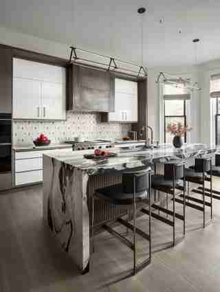
“Searching for stone was like searching for artwork,” says Manke, who worked intimately with Nelson-Rice to find marble and stone unlike any she’d seen before. The graphic black and white of the kitchen slab is softened by gray leather Powell & Bonnell stools.
Russell Young’s portrait of Barack Obama was such an important piece that the team put it in the 3D model and designed the dining room around it. “We made decisions wholeheartedly based on viewing the space as a gallery for contemporary Black artists,” Woodward says, adding that “Robin was really thrilled to do that. Very early on, we were conscious of showing restraint in the materials palette, so we could let the art stand out.” Also of note, a Bec Brittain (sourced from the Future Perfect ) chandelier reflects magically on the ceiling.
“It’s something that anchors this home in its place, that makes it a Boston home and not a home from somewhere else,” says Hacin of the monumental stairway dancing through the house’s many stories. It was formerly painted mint green and cream. After he suggested painting it black, Hacin knew Nelson-Rice was ready to take chances. To complement the magnificent stair, the design team sought out special sculptural pieces and grounded the home in accents and artworks by the likes of Whitfield Lovell.
“Sultry is what we were going for,” Nelson-Rice says of the primary bedroom, which features a sumptuous Marc Phillips carpet, Callidus Guild wallpaper and Holly Hunt’s Pampa bed. A Patrick Naggar sconce, a Kathy Erteman stoneware commission, and a Russell Young artwork enhance the mood.
Nelson-Rice’s dressing room features a Molteni tone-on-tone closet, elegant and smooth. Inside, “there’s this explosively colorful collection of running shoes, and to me it’s a bit of a metaphor for her in the house,” Hacin says. Cheery and bright, the warm bronze finish on the mirrors catches the sun in a beautiful way, Manke says. “When the interior closet lights are on, it’s semitransparent, so it has a very ethereal feeling.” Like the house at large, it’s a true reflection of Nelson-Rice: glamorous but unassuming.
The placement of the third-floor primary bathroom was a big decision, and, ultimately, it connects the closet in the front of the house with the couple’s bedroom. Despite it being a long, linear interior room, the sleek space with a Kelly Wearstler stool and strong lines is luminous, thanks to frosted glass and Bec Brittain sconces.
“It was ultimately so exciting to have this amalgam of Robin’s personality transpire in the interiors,” says Woodward, who took Nelson-Rice to ICFF (the first time he’s done that with a client), where she wanted to see the newest offerings from every vendor. In the guest room, they combined soft, tonal pieces with texture, including a Merida carpet, a Verellen bed, and quirky Enny Lee Parker stools. “There’s a boldness about this home that feels unlike other houses in the neighborhood,” Hacin says, adding that it’s simultaneously calm but stimulating.
“My husband loves the top floor with the pool table,” Nelson-Rice says. This house is the couple’s first designed without kids in mind, and, Hacin says, “she wasn’t worried about being a mom or wife, she wanted to do Robin. She put all these tiny touches throughout that were a function of her personality.” The matriarch’s metric for buying art is: “Is it loving me, am I loving it back?” The trio of flags made of album spines by Walter Lobyn Hamilton is a personal favorite, as it embodies the power of music. Also in the daylit game room are a playful Vibia chandelier and Moses Nadel ottomans.
The spa pool, added late to the scope of work, was “a structural feat of engineering,” Manke says. Ultimately, the pool was fabricated in stainless steel, and tiled and finished in California. The living moss wall, inspired by 1 Hotel South Beach’s by Plant the Future, was another challenge. “Cut to Christine and me on scaffolding over the pool gluing moss for hours because we love Robin,” Woodward laughs. She’s “a dream client, so we didn’t mind—anything for Robin!” Meanwhile, Nelson-Rice uses it every couple days, “and I don’t turn any lights on because I don’t want my husband to know I’m down there—I want to have it all to myself!”
Nelson-Rice spends lots of time in the courtyard, which features Gloster lounge chairs and a linear Ore fire pit.
With a spacious rooftop with views of the Charles River and Boston’s skyline, plus multiple other patios, the 8,200-square-foot home offers an extraordinary array of unique experiences. This fifth-floor balcony features outdoor furniture by Gloster.

Leave a Reply