To borrow a phrase from Cher, Wired magazine was living in a house divided. Its print and digital operations—which were acquired separately by Condé Nast (*Architectural Digest’*s parent company), in 1998 and 2006, respectively—were Balkanized on the same floor of conjoined 19th-century buildings in the tech mecca of San Francisco’s SoMa district. The ungracious passageway between the two distinct spheres was known as “the Berlin hall.” In order to foster esprit de corps in a fully integrated, state-of-the-art workplace, Wired decided to heed Cher’s sage advice: “The walls have got to fall.”
“The architecture was a divisive force,” says Scott Dadich, editor in chief of the trailblazing journal of technology and culture. “We decided to tear down the literal and figurative walls between print and digital, and reorganize the staff into teams based on subject matter, regardless of the platform. It’s now a big open canvas that allows for flexibility in work modes and change over time.”
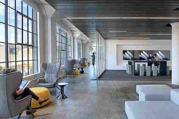
Abetting that effort was the team from commercial design giant Gensler, led by design director Karyn Gabriel and project principal Lisa Bottom. “We gutted the entire office and reimagined it as a space that would draw in Wired ’s community, a space for creating something new. Instead of using magazine covers to tell the Wired story, the entire office now communicates the spirit and culture of the magazine,” Gabriel explains.

The most prominent feature of the design is a floating ceiling plane of slatted black metal that zigs and zags overhead, visually unifying the different regions of the office and concealing the thicket of wires and cables that powers the workplace. At various points, the ceiling plane folds down onto walls, creating a sleek, modern counterpoint to the 19th-century structure’s massive concrete columns and casement windows.
The coup de théâtre, however, is the content review room, a contemporary update on the antiquated paradigm of the layout wall. The space is bordered by demountable glass panels and positioned just off the entry for maximum exposure. Utilizing giant touch screens that run on a vanguard software program developed by Wired and Adobe, editors, designers, photographers, and producers can review images, manipulate layouts, or stream video simply with hand gestures. “It feels like* Minority Report*,” says Dadich, citing the futuristic crime-fighting movie. “We put the room front and center so that staff and visitors alike can see what we’re working on—and what we’re all about.”
__[
Click here to see more photographs of Wired’s new offices.
](/blogs/daily/2015/08/wired-offices-gensler-slideshow)__

Leave a Reply